
The Poster: Design Made Public
How typography, colour and composition transformed a simple sheet of paper into one of design's most powerful cultural mediums.
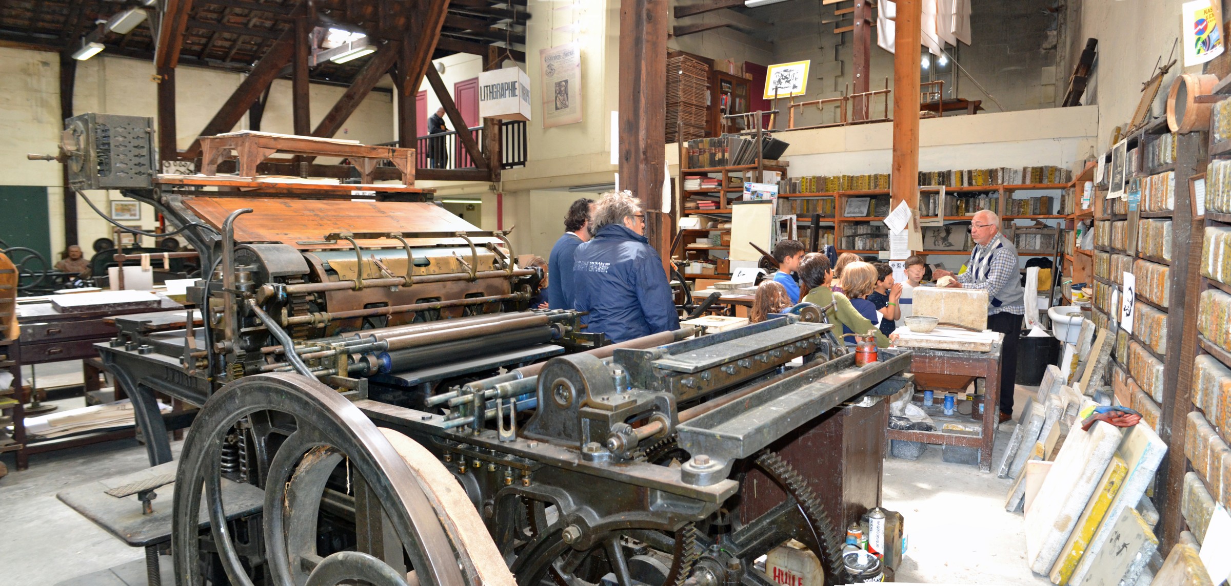
Before the smartphone, before digital advertising and long before information travelled instantly between screens, the poster was one of the most powerful ways to communicate with the public.
It announced performances, advertised products, promoted political movements and introduced audiences to new ideas.
Its location was rarely glamorous.
Posters appeared on walls, railway platforms, shop windows and the sides of buildings. They competed for attention in busy streets, surrounded by movement, conversation and countless other distractions.
Yet within these ordinary environments, graphic designers and artists created some of the most memorable images of the modern era.
A striking arrangement of colour could stop somebody walking past. An unusual typeface could make an unfamiliar name instantly recognisable. A single image could communicate an idea before the viewer had time to read a sentence.
The poster occupied an unusual position between art and communication.
It needed to attract attention, deliver information and leave an impression, often within seconds.
And in meeting those demands, it helped establish many of the visual principles that continue to influence design today.
When the Street Became a Gallery
During the late nineteenth century, improvements in colour lithographic printing transformed the possibilities of commercial poster production.
Images could be reproduced in increasingly vibrant colours, making posters more visually appealing and economically practical.
Paris became an important centre of this development.
The city's growing entertainment industry created demand for advertisements promoting theatres, cabarets, concerts and other public attractions.
Artists recognised the creative possibilities.
Jules Chéret became particularly influential through his colourful compositions, energetic figures and inventive use of lettering.
His posters brought an expressive artistic quality to material that had previously been associated primarily with commercial announcements.
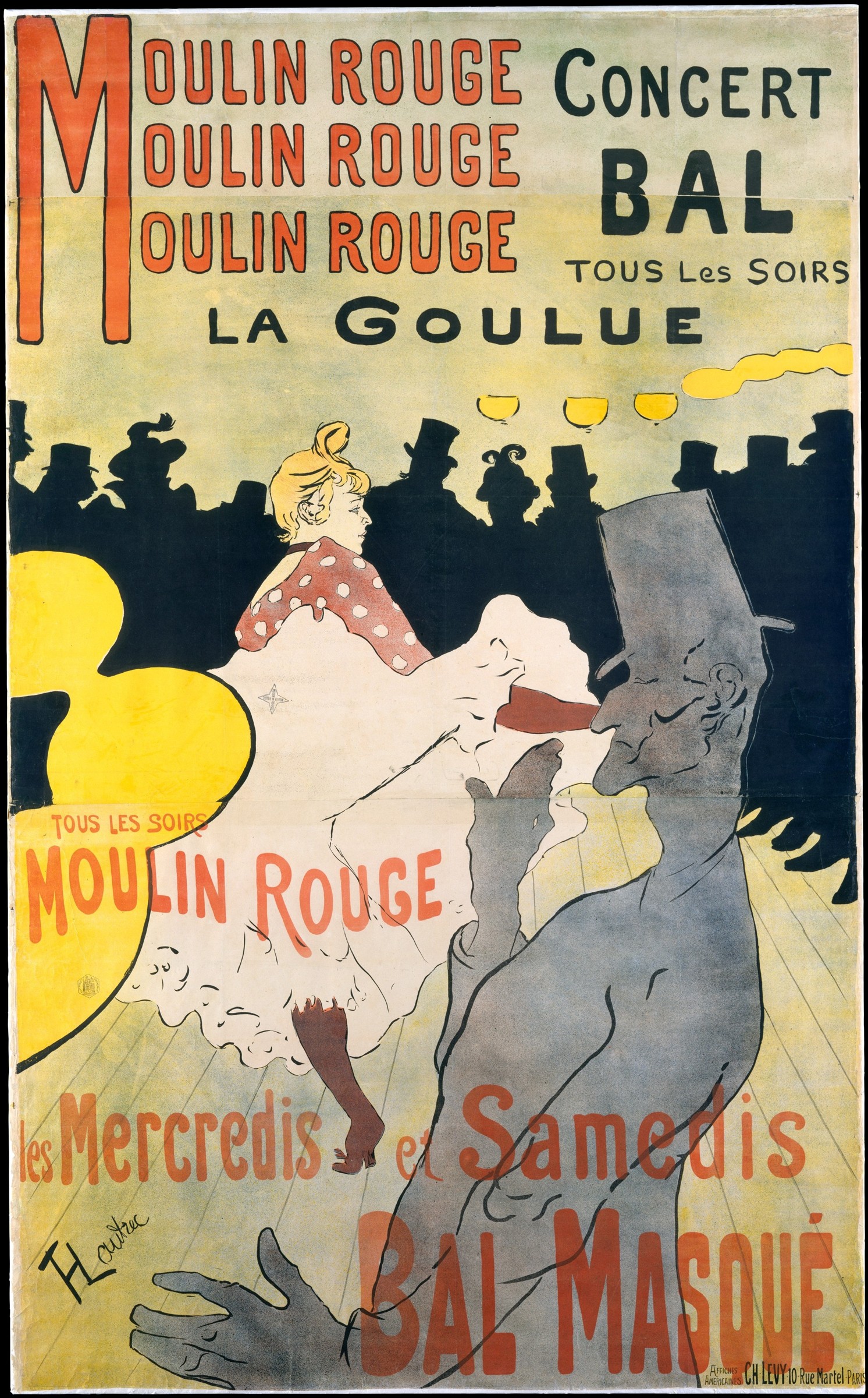
Henri de Toulouse-Lautrec developed another distinctive approach.
His posters for Parisian nightlife combined bold silhouettes, simplified forms and unconventional compositions.
Rather than attempting to reproduce a scene with photographic accuracy, he often concentrated on the elements that communicated its atmosphere most effectively.
A figure might be reduced to a recognisable outline. A background could become a broad area of colour. Lettering was incorporated into the visual composition rather than treated as an afterthought.
These decisions made the images distinctive and immediately recognisable.
They also challenged the boundary between fine art and commercial design.
The poster was no longer simply a notice containing information.
It had become a creative medium with its own visual language.
The Art of Saying More With Less
As the twentieth century progressed, poster designers increasingly experimented with abstraction, geometry and simplified imagery.
The rise of modern transport, industrial production and commercial advertising created new subjects to communicate.
One particularly influential designer was Adolphe Mouron Cassandre.
Born in Ukraine and active primarily in France, Cassandre became celebrated for his striking Art Deco posters.
His 1927 advertisement for the Nord Express railway service demonstrates the power of his approach.
Rather than presenting a conventional illustration of a train, Cassandre used dramatic perspective, geometric forms and carefully controlled typography to communicate speed and modernity.
The locomotive becomes an almost architectural object.
Its exaggerated proportions and dynamic composition suggest movement and technological progress.
The design does not require a detailed explanation.
Its visual impact communicates the essential idea.
Cassandre understood that a successful poster had to work at a distance.
Viewers might encounter it briefly while walking through a station or travelling along a busy street.
Complex information needed to be organised into something immediately understandable.
This principle remains central to graphic design.
Removing unnecessary detail does not necessarily weaken a message.
Sometimes, it allows the most important idea to become more powerful.
The Swiss Search for Clarity
Following the Second World War, Switzerland became a major centre of modern graphic design.
Designers associated with what became known as the International Typographic Style, or Swiss Style, pursued a systematic approach to visual communication.
Their work emphasised clarity, precision and carefully structured layouts.
Typographic grids provided an underlying framework for arranging text and imagery.
Sans-serif typefaces became important elements of the visual language.
Photography, geometric shapes and restrained colour palettes were frequently used to communicate information without unnecessary ornament.
Among the movement's most influential figures was Josef Müller-Brockmann.
His concert posters for Zurich's Tonhalle demonstrated how visual composition could communicate the character of music.
Lines, circles and geometric arrangements created rhythm and movement across the printed surface.
Typography was positioned with extraordinary care.
The relationship between elements was often more important than any individual decorative feature.
Müller-Brockmann's work helped establish the grid as a practical instrument of graphic design.
The grid was not simply a collection of invisible lines.
It was a way of creating relationships between information, imagery and empty space.
Used thoughtfully, it allowed complex material to become visually coherent.
These principles would influence corporate identities, publications, signage and eventually digital interfaces.
Even today, many websites rely on approaches to spacing, alignment and typographic hierarchy that owe something to this period of graphic design history.
The technologies have changed.
The underlying problem of organising information has not.
Poland's Unexpected Creative Language
Not every important movement in poster design pursued the clarity and discipline associated with Swiss modernism.
In post-war Poland, a very different visual tradition emerged.
The Polish School of Posters became internationally recognised for its expressive illustrations, unusual compositions and imaginative interpretations of cultural subjects.
Film posters were particularly important.
Artists including Henryk Tomaszewski, Eryk Lipiński and Jan Lenica developed distinctive approaches to promoting cinema.
Rather than simply reproducing photographs of actors or dramatic scenes from films, designers often created original interpretations of their subjects.
A psychological thriller might be represented by an unsettling illustration.
A romantic story could become an abstract composition.
A single symbolic image might communicate the atmosphere of a film without revealing its narrative.
These posters frequently resembled independent artworks as much as conventional advertisements.
Their appearance reflected the particular circumstances of Poland's cultural and political environment.
State-controlled film distribution created a different commissioning structure from the commercial Hollywood system, although artists still worked within political and institutional constraints.
Within those conditions, a distinctive creative tradition developed.
The results could be humorous, unsettling, poetic or deliberately ambiguous.
Importantly, they did not always attempt to provide a literal representation of the product being advertised.
They offered an interpretation.
This approach expanded the possibilities of the poster.
It demonstrated that visual communication could be effective without being entirely straightforward.
Sometimes, curiosity and ambiguity could attract attention more successfully than an obvious image.
Design as a Public Voice
Posters have never existed solely to advertise products or cultural events.
They have also played important roles in politics, public campaigns and social movements.
Their accessibility makes them particularly suited to communicating messages beyond traditional institutions.
A poster can be printed relatively quickly, displayed publicly and reproduced in large numbers.
It does not require the viewer to purchase a publication or enter a particular building.
During periods of political protest, graphic design has frequently become part of the visual language of public expression.
The student and worker demonstrations in France during May 1968 produced a notable collection of protest posters, many created collectively through the Atelier Populaire.
These works often used simplified imagery, bold lettering and limited colours.
Their messages were intended to be direct and immediately understandable.
The emphasis was not on creating decorative objects for private appreciation.
It was on communicating ideas in public space.
Of course, the same visual techniques can also be used for propaganda, manipulation or misleading information.
An effective poster is not necessarily a truthful one.
Graphic design can make an argument appear convincing regardless of its merits.
This gives the medium a responsibility extending beyond visual appearance.
Colour, imagery and typography influence not only what people notice, but also how they interpret the information presented to them.
The designer therefore participates in shaping the message.
A poster is never entirely neutral.
Why Typography Matters
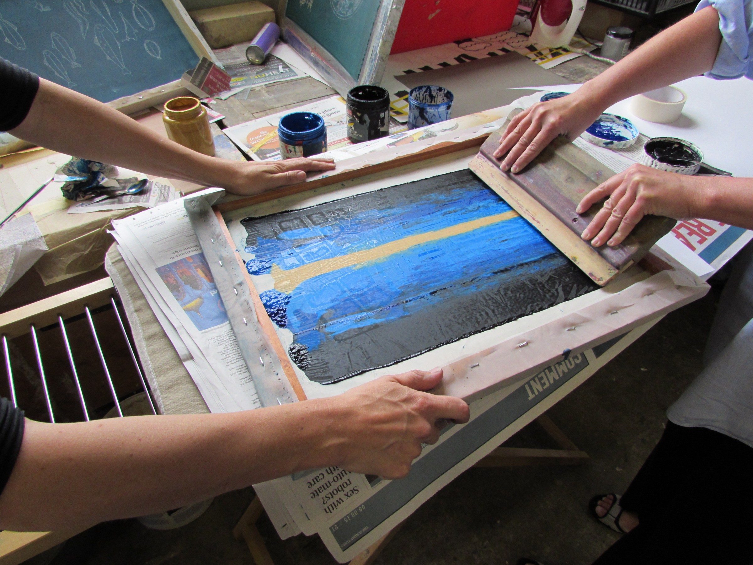
One of the most remarkable qualities of poster design is the expressive power of lettering.
Words communicate information, but their visual appearance can communicate something additional.
Large, condensed lettering might create urgency.
An elegant serif typeface can suggest tradition or cultural refinement.
Bold geometric characters may communicate confidence, modernity or technological ambition.
The position of text also matters.
A word placed at the centre of a composition has a different relationship with the viewer from one positioned quietly in a corner.
Spacing influences rhythm.
Scale determines hierarchy.
Contrast helps establish what the audience should notice first.
These decisions may appear minor when considered individually.
Together, they can completely transform the character of a message.
Some of the most memorable posters contain very little imagery.
Their visual identity comes almost entirely from typography, proportion and the relationship between printed elements and empty space.
This is one reason poster design remains such a valuable subject for students of visual communication.
It requires designers to make decisions about what matters.
There is limited space, limited time to capture attention and often a considerable amount of information to communicate.
Every element must earn its place.
The Poster in a Digital World
Today, much of the communication once delivered through printed posters takes place on digital screens.
Exhibitions are announced on social media. Concerts are promoted through online campaigns. Political messages circulate through platforms capable of reaching enormous audiences almost immediately.
The physical poster no longer occupies the same position in public communication that it once did.
But its design principles remain remarkably influential.
A social media graphic must still capture attention.
A digital advertisement must still establish a clear visual hierarchy.
A website banner must still balance typography, imagery and limited space.
In many ways, the demands are familiar.
The viewing conditions, however, have changed.
A printed poster exists within a physical environment. It can be viewed from different distances, encountered repeatedly and experienced alongside the architecture of a street.
A digital image appears within a constantly changing sequence of other content.
It may disappear from view almost immediately.
The competition for attention is arguably more intense, while the time available to communicate can be extremely short.
This makes the lessons of historic poster design especially relevant.
Strong composition, clarity and a recognisable visual identity remain effective regardless of the medium.
Yet printed posters continue to possess qualities that screens cannot entirely reproduce.
Paper has texture and weight.
Printing techniques create distinctive surfaces.
A poster placed on a wall becomes part of its surroundings, gradually affected by light, weather and time.
Its physical presence connects graphic design to the environment in which it appears.
The Value of a Single Image
The poster is a deceptively simple object.
A sheet of paper, an image and a collection of words.
Yet across generations, designers have used those elements to communicate extraordinary amounts of information and emotion.
The colourful advertisements of nineteenth-century Paris established new relationships between art and commerce.
Cassandre demonstrated the expressive potential of geometry and dramatic composition.
Swiss designers developed systematic approaches to typography and visual organisation.
Polish poster artists showed how imagination and interpretation could transform commercial commissions.
Political movements used the poster to communicate ideas directly within public spaces.
Each tradition approached the medium differently.
But all recognised the same fundamental possibility.
A visual message could change how somebody understood what they were seeing.
Today, the poster survives in museums, private collections, cultural venues and the streets of cities around the world.
Its influence is also visible in places where paper has disappeared entirely.
The typography of a website.
The composition of a digital advertisement.
The carefully arranged information on a mobile screen.
These contemporary designs continue to address questions that poster artists confronted more than a century ago.
What deserves attention?
What can be removed?
And how can a visual idea communicate something meaningful in a matter of seconds?
The materials and technologies will continue to evolve.
But the essential challenge remains.
Sometimes, one image is enough to change the way we look at something.
Further Reading

The Quiet Intelligence of Everyday Objects
OXO Good Grips, Harry Beck's Tube map and the Anglepoise lamp reveal how the best everyday design makes its effort almost impossible to notice.
By Culturefold Editors
The Art of Seeing Differently
A closer look at how creativity changes our understanding of familiar places, everyday objects and the world we inhabit.
By Culturefold Editors