
The Colour That Changed Art
From precious pigments and Renaissance masterpieces to Picasso's melancholy paintings and Yves Klein's extraordinary blue canvases, the remarkable story of a colour that has fascinated artists for centuries.
Some colours seem almost impossible to separate from the world around us.
Green belongs to landscapes and vegetation. Red frequently suggests warmth, intensity or danger. Yellow brings to mind sunlight and brightness.
Blue, however, occupies a particularly curious position.
It is the colour of the sky and the sea, two of the most expansive elements of our natural environment. Yet for much of human history, producing a vivid and durable blue pigment was extraordinarily difficult.
Artists could see blue everywhere, but recreating its brilliance required materials that were often rare, expensive or technically challenging to prepare.
That difficulty helped make the colour particularly valuable.
In religious paintings, blue could communicate devotion and spiritual significance. In landscapes, it created atmosphere and distance. For modern artists, it became a way of exploring emotion, abstraction and even the boundaries of painting itself.
Few colours have travelled through art history with such varied meanings.
From the mineral-rich mountains of Afghanistan to the studios of twentieth-century Europe, the story of blue is also a story about changing technology, artistic ambition and the extraordinary relationship between colour and human perception.
When Blue Was More Valuable Than Gold
For centuries, one of the most desirable blue pigments available to European painters was natural ultramarine.
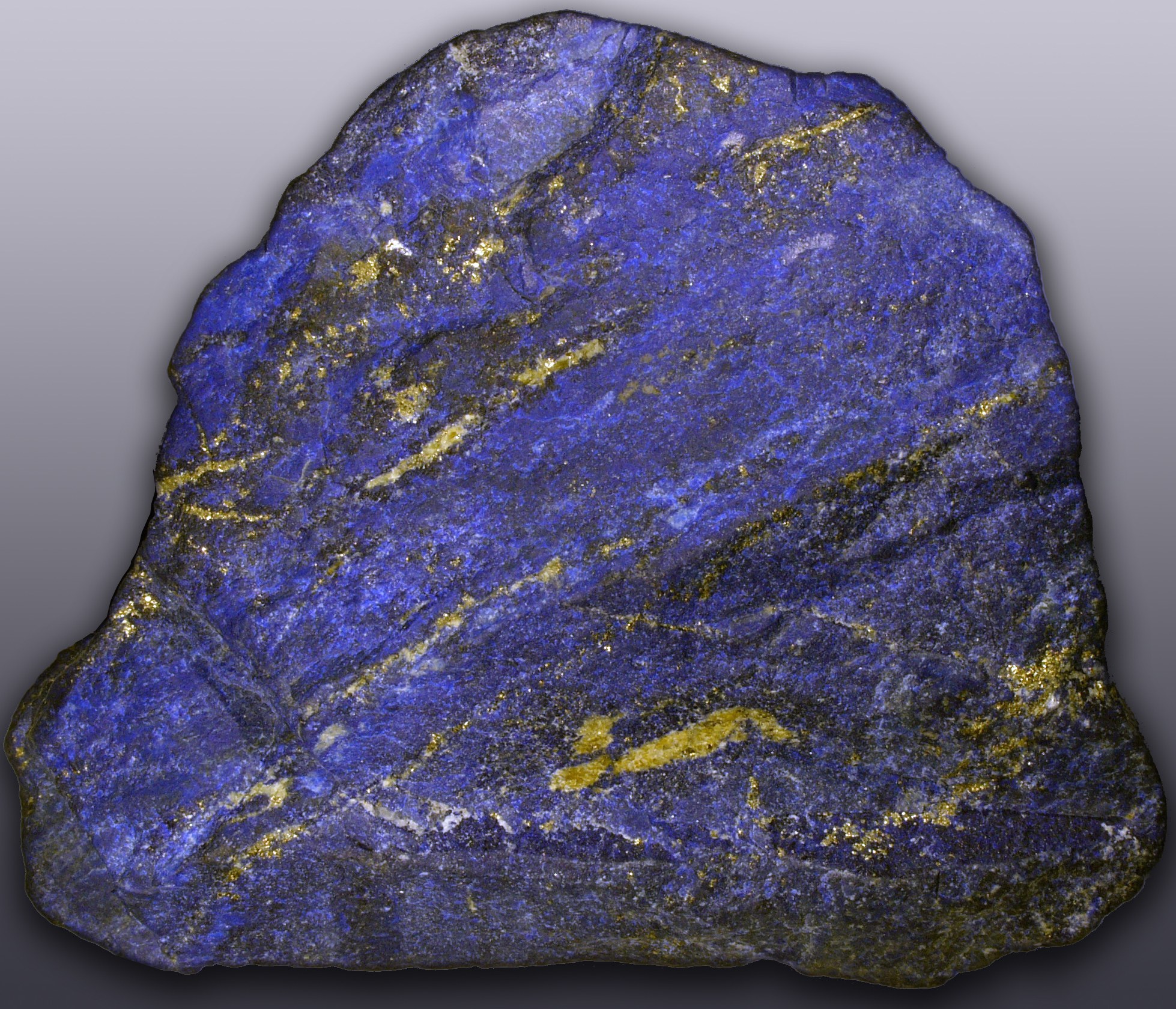
Its extraordinary colour came from lapis lazuli, a semiprecious stone historically mined in what is now Afghanistan.
The journey from mineral to painting was complicated.
The stone had to be transported across considerable distances before undergoing an elaborate process to separate the valuable blue pigment from its other mineral components.
The resulting ultramarine possessed a depth and intensity that made it highly desirable.
But its rarity and difficult preparation meant that it could be exceptionally expensive, sometimes costing more than gold by weight.
For artists, this created practical limitations.
A painter might have access to a range of earth pigments and relatively inexpensive materials, yet a large area of brilliant ultramarine could represent a substantial financial commitment.
The choice of colour therefore carried economic significance.
In religious painting, the finest blue pigments were frequently reserved for particularly important figures.
The Virgin Mary was often depicted wearing a rich blue mantle, a tradition that became especially prominent in European medieval and Renaissance art.
The colour communicated more than visual beauty.
Its expense and rarity could reinforce the spiritual importance of the subject.
Patrons who commissioned religious paintings sometimes specified the quality or quantity of ultramarine to be used.
A colour visible on the finished surface could therefore reveal something about the wealth, ambitions and devotional priorities behind the commission.
This is one of art history's most interesting contradictions.
An apparently simple visual decision could be shaped by international trade, geology and the economic circumstances of the artist's time.
Blue was not merely a colour.
It was a material of extraordinary value.
Giotto and the Painted Heavens
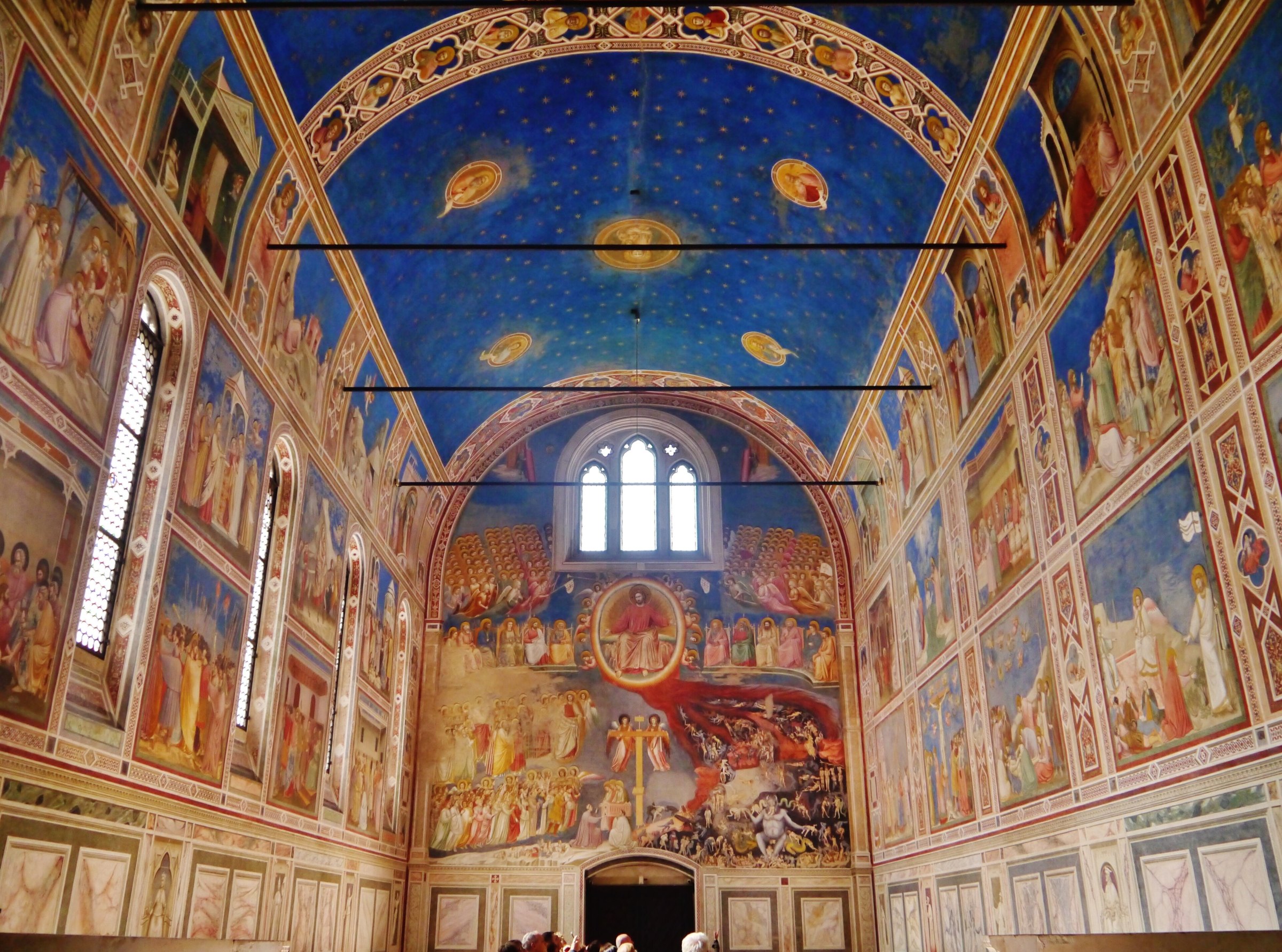
In Padua, Italy, the Scrovegni Chapel offers one of the most memorable encounters with blue in early European painting.
Decorated by Giotto during the opening years of the fourteenth century, the chapel contains an extraordinary cycle of frescoes depicting scenes from the lives of the Virgin Mary and Christ.
The painted narratives extend across the interior walls, presenting religious stories through carefully organised compositions and expressive human figures.
But look upwards, and another element of the building becomes immediately apparent.
The vaulted ceiling is covered in a deep blue field scattered with golden stars.
Circular medallions containing religious figures punctuate the celestial composition.
The effect is remarkable.
The physical ceiling appears transformed into an imagined night sky.
Its rich colour creates a visual relationship between the religious narratives below and the heavens above.
Rather than functioning simply as a decorative background, the blue becomes central to the chapel's atmosphere.
It communicates a sense of scale extending beyond the architectural boundaries of the building.
The viewer is standing within a relatively modest enclosed space.
Yet the painted ceiling suggests something immeasurably larger.
Giotto's work demonstrates how colour can influence our perception of architecture and artistic space.
The ceiling remains physically unchanged, but its painted surface transforms the experience of looking upwards.
It creates an impression of depth, symbolism and emotional significance through colour alone.
More than seven centuries later, the effect remains extraordinary.
A Scientific Revolution in Blue
For much of art history, an artist's palette was limited by the availability and cost of pigments.
Different shades of blue came from different materials, each with particular advantages and limitations.
Azurite, a copper-based mineral pigment, provided another important source of blue.
Smalt, produced using coloured glass, offered an alternative, although its appearance and stability could present difficulties.
Then, during the early eighteenth century, an accidental discovery helped transform the possibilities of painting.
A pigment now known as Prussian blue emerged in Berlin, generally associated with the work of Johann Jacob Diesbach around 1704–1706.
Unlike natural ultramarine, Prussian blue was a manufactured pigment.
It offered a powerful, relatively affordable blue that could be produced without relying on rare mineral deposits.
Its introduction gradually expanded the range of colours available to artists.
The change was significant.
A painter no longer needed access to extremely expensive lapis lazuli to achieve a strong, saturated blue.
New possibilities emerged for landscapes, portraits, decorative arts and printmaking.
The development also demonstrated how scientific discovery could influence artistic expression.
Pigments are not simply colours chosen from a catalogue.
They are physical materials with particular chemical properties.
Their availability can determine what artists are able to create.
A new pigment can expand the visual possibilities of an entire generation.
And in the case of Prussian blue, its influence would eventually extend far beyond Europe.
Hokusai and the Great Wave
Few artworks demonstrate the expressive power of blue more immediately than Katsushika Hokusai's The Great Wave off Kanagawa.
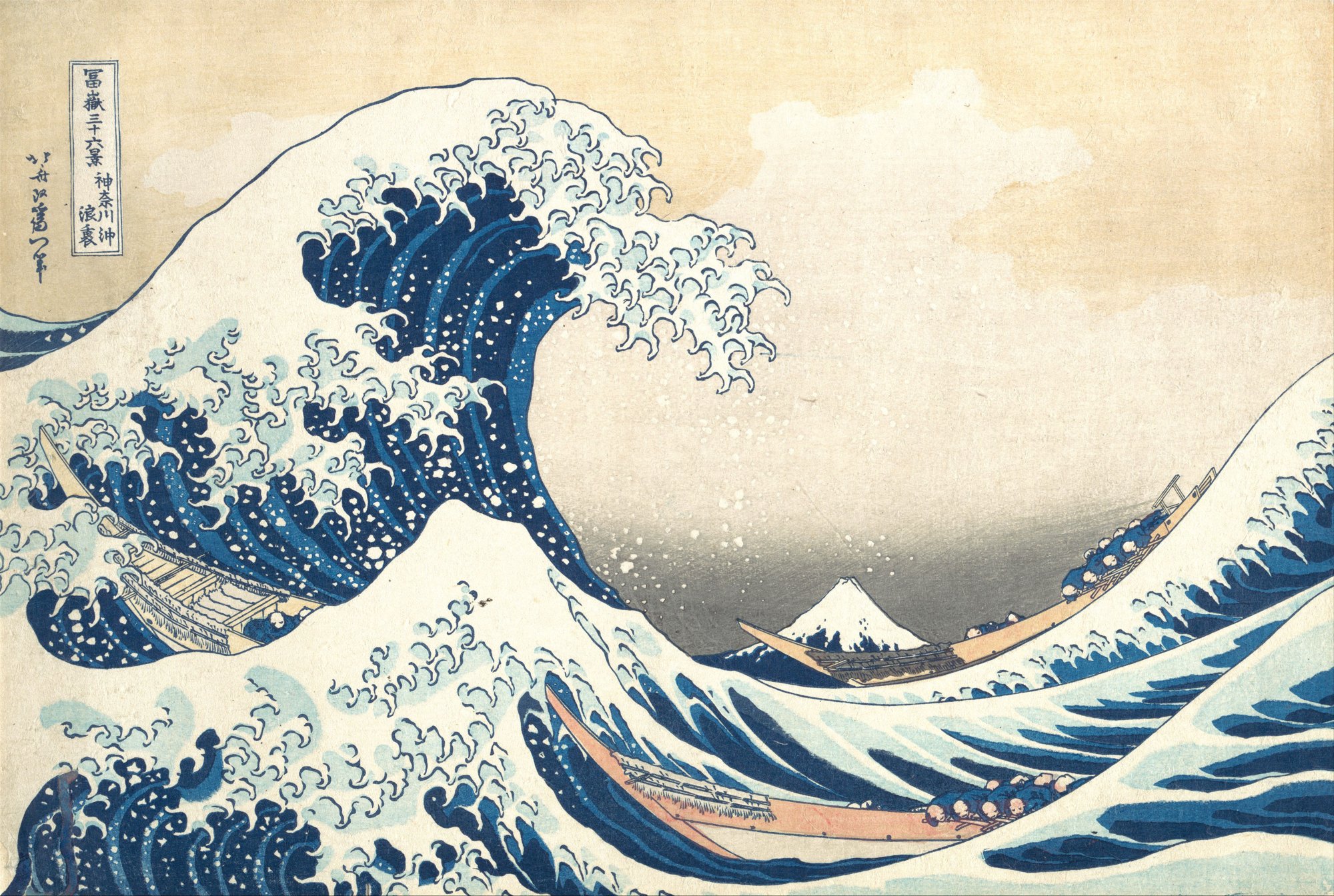
Created around 1830–1832 as part of his celebrated series Thirty-six Views of Mount Fuji, the woodblock print has become one of the most recognisable images in art history.
Its composition is dramatic.
An enormous wave rises above a group of small boats, its curling crest appearing almost ready to collapse upon them.
In the distance, Mount Fuji sits beneath the opening formed by the wave.
The mountain appears surprisingly small.
The image balances an immense sense of movement with carefully controlled composition.
Blue plays an essential role.
Hokusai's printmakers used Prussian blue alongside traditional indigo, producing a striking range of tones and contrasts.
The darker outlines emphasise the movement of the water.
Brighter blue areas create depth and intensity.
The white spaces between them suggest the spray and foam of the breaking wave.
These colours helped give the image its extraordinary visual impact.
The arrival of Prussian blue in Japan had provided artists and printmakers with new opportunities to represent landscapes and atmospheric effects.
Hokusai's work demonstrates how those possibilities could be transformed through artistic imagination.
But the print also reveals the importance of craftsmanship.
Woodblock prints were collaborative objects involving designers, block cutters, printers and publishers.
The remarkable colour relationships visible in The Great Wave were achieved through technically demanding printing processes.
Different pigments could be layered to create greater depth and variation.
The result is an image in which artistic invention and technical knowledge work together.
Nearly two centuries later, the print remains visually compelling.
Its influence has extended into graphic design, illustration, fashion and popular culture.
And the extraordinary blue of its towering wave remains central to its identity.
Picasso's Years of Blue
By the beginning of the twentieth century, blue had acquired another powerful artistic association.
Emotion.
Between approximately 1901 and 1904, Pablo Picasso developed a distinctive body of paintings now known as his Blue Period.
The works are characterised by predominantly blue and blue-green tones, frequently used to depict figures experiencing poverty, isolation, grief or hardship.
The period followed the death by suicide of Picasso's close friend Carles Casagemas in 1901.
Although Picasso's artistic development cannot be explained by a single event, the loss contributed to the emotional circumstances surrounding his work.
His subjects became increasingly sombre.
Figures appear isolated within sparse environments.
Bodies are often elongated, their expressions subdued.
The restrained palette intensifies the atmosphere.
In The Old Guitarist, painted around 1903–1904, an elderly musician bends over his instrument.
His body appears thin and vulnerable.
Much of the composition is dominated by muted blue tones, while the warmer colour of the guitar creates a striking contrast.
The effect is deeply emotional.
The painting does not require elaborate surroundings or dramatic gestures.
Its atmosphere emerges through posture, composition and colour.
Blue becomes something more than a means of describing the visible world.
It becomes a tool for communicating psychological experience.
The choice is particularly interesting because the subjects themselves do not need to be blue.
The colour is an artistic interpretation rather than a literal record of appearance.
Picasso uses it to establish a particular emotional environment.
The paintings invite viewers to experience sadness, vulnerability and isolation through the visual language of colour.
His Blue Period demonstrates how a restricted palette can communicate an extraordinarily wide range of human feeling.
Sometimes, using fewer colours allows an artist to say more.
The Arrival of Affordable Ultramarine
The development of synthetic pigments also transformed the relationship between artists and blue.
During the nineteenth century, chemists developed methods for producing artificial ultramarine.
In 1828, French chemist Jean-Baptiste Guimet received a prize for his work on manufacturing a synthetic alternative to the precious natural pigment.
The new material offered a comparable intensity at a fraction of the traditional cost.
For painters, the implications were considerable.
Brilliant blues became more accessible, allowing artists to experiment without the same financial restrictions that had influenced earlier generations.
The availability of new pigments coincided with broader changes in painting materials.
Commercially prepared paints, improvements in manufacturing and the development of portable paint tubes contributed to changing working practices.
Artists increasingly explored colour directly within landscapes and outdoor environments.
Painters associated with Impressionism developed new approaches to representing light, weather and the changing appearance of the natural world.
Blue became central to many of these experiments.
Rivers, shadows, distant hills and atmospheric conditions could be expressed through carefully observed relationships between different hues.
The new materials did not automatically create artistic innovation.
But they expanded the practical possibilities available to artists.
The history of colour is therefore inseparable from the history of technology.
What artists can imagine is not always identical to what their materials allow them to produce.
When those materials change, artistic possibilities can change with them.
Yves Klein: When Blue Became the Entire Painting
In the middle of the twentieth century, French artist Yves Klein took the significance of blue in an extraordinary new direction.
Rather than using the colour to represent landscapes, figures or objects, he began creating paintings consisting entirely of blue surfaces.
These monochromatic works rejected many of the conventions associated with traditional painting.
There was no recognisable subject.
No arrangement of figures.
No narrative scene requiring interpretation.
Instead, the viewer encountered an intense field of colour.
In 1957, Klein presented a series of blue monochromes at the Galleria Apollinaire in Milan.
The paintings were remarkably similar in appearance, but Klein considered each a distinct artistic experience.
For him, blue possessed a particular relationship with space, freedom and the immaterial.
He became fascinated by the idea that colour could communicate something beyond the physical boundaries of an artwork.
One of his most important achievements involved developing a method of preserving the extraordinary intensity of ultramarine pigment.
Working with Parisian colour supplier Édouard Adam, Klein experimented with a synthetic resin that allowed the pigment to retain much of its vivid, powdery appearance.
The resulting technique became associated with International Klein Blue, commonly abbreviated to IKB.
In 1960, Klein registered the process with the French authorities.
Contrary to a popular misconception, he did not obtain exclusive ownership of the colour blue itself.
The registration concerned the particular technical process used to produce his distinctive paint.
The achievement was both practical and conceptual.
Klein had found a way to make the colour itself the primary subject of his work.
The surface no longer needed to represent something else.
Its presence was enough.
What Happens When the Image Disappears?
Standing before one of Klein's blue monochromes raises an interesting question.
What exactly are we looking at?
There is no landscape to identify.
No figure whose expression we must interpret.
No obvious story developing within the composition.
The painting presents an apparently uninterrupted field of saturated colour.
Yet the experience is not necessarily empty.
The intensity of the pigment can create an unusual sense of depth.
The surface appears simultaneously physical and difficult to define.
Its colour seems to extend beyond the boundaries of the canvas.
For some viewers, the effect is contemplative.
For others, it may be frustrating or difficult to understand.
Both responses are part of the wider conversation surrounding abstract art.
Klein challenged the assumption that painting must always involve representation.
He suggested that colour could become an independent artistic experience.
This was a remarkable departure from the role blue had played in much of European art history.
Centuries earlier, expensive ultramarine had been used to communicate the significance of religious subjects.
Picasso employed a predominantly blue palette to establish emotional atmosphere.
Klein removed the subject almost entirely.
The colour itself became the event.
Why Blue Means Different Things
It is tempting to assign colours universal emotional meanings.
Blue is frequently described as peaceful, trustworthy, melancholy or reflective.
But these associations are neither fixed nor identical across cultures.
Their meaning depends on historical circumstances, personal experiences and the context in which the colour appears.
A blue sky may suggest openness and freedom.
A dark blue interior can feel intimate or mysterious.
The blue robes of a religious painting may communicate spiritual importance.
Picasso's paintings use similar colours to express isolation and sorrow.
Klein's monochromes invite an entirely different interpretation, encouraging viewers to consider colour as an experience in its own right.
The physical colour may be familiar.
Its meaning is shaped by the artwork surrounding it.
This flexibility is one of blue's most interesting qualities.
It can appear natural or artificial, comforting or unsettling, decorative or intensely symbolic.
Artists exploit these possibilities through their choices of shade, composition and material.
A pale blue wash behaves differently from a deeply saturated ultramarine surface.
A translucent watercolour produces an experience unlike that of thickly applied oil paint.
Even when two artworks use similar hues, their textures and surroundings can alter the way the colour is perceived.
Blue does not communicate a single idea.
It provides artists with a remarkably flexible language.
A Colour That Continues to Evolve
Contemporary artists work with a range of blue pigments and materials that earlier generations could scarcely have imagined.
Synthetic paints, digital technologies, industrial coatings and new manufacturing processes have expanded the possibilities of colour.
An artist can produce a large monochromatic surface, an illuminated installation or an image composed entirely of digital light.
The technical limitations that once made blue exceptionally expensive have changed dramatically.
Yet the colour continues to attract artistic attention.
Its associations with the natural world remain powerful.
Its relationship with emotion continues to offer possibilities for expression.
And its ability to create intense visual experiences has not diminished.
The story of blue also reminds us that art is never separate from the materials through which it is created.
A rare mineral from Afghanistan influenced religious painting in Europe.
A manufactured pigment developed in Berlin helped transform Japanese printmaking.
A twentieth-century painter used a restricted palette to explore human vulnerability.
Another developed a new painting technique to turn colour into an independent artistic subject.
These are very different artistic achievements.
Yet they are connected through a single colour.
Beyond the Surface
The history of blue reveals something remarkable about the relationship between art and the world around it.
A colour can begin as a precious material.
It can acquire religious significance, become an instrument of artistic innovation and eventually develop into a subject worthy of an entire painting.
Its story passes through mountains, trading routes, laboratories, studios and museums.
But perhaps the most interesting aspect is how differently artists have understood the same visual experience.
Giotto transformed a chapel ceiling into a celestial space.
Hokusai used vivid blues to communicate the extraordinary power of the sea.
Picasso found a language for sadness and vulnerability.
Yves Klein explored the possibility of colour existing beyond representation.
Each artist approached blue with different intentions.
Each discovered something that previous generations had not expressed in quite the same way.
And each contributed to the changing meanings attached to a colour we encounter every day.
The sky has always been blue under the right conditions.
The sea has reflected variations of it for far longer than human beings have existed.
Yet reproducing, understanding and interpreting that colour has occupied artists for centuries.
Perhaps this is what makes the history of blue so compelling.
It demonstrates that even something completely familiar can contain extraordinary complexity.
A single colour can carry the history of materials, technology, belief and human emotion.
And sometimes, an entire world of artistic possibility can exist within one shade.
Further Reading
The Art of Repetition
Some of the most influential artists in history returned to the same subject again and again — and found extraordinary possibilities in doing so.
By Culturefold Editors
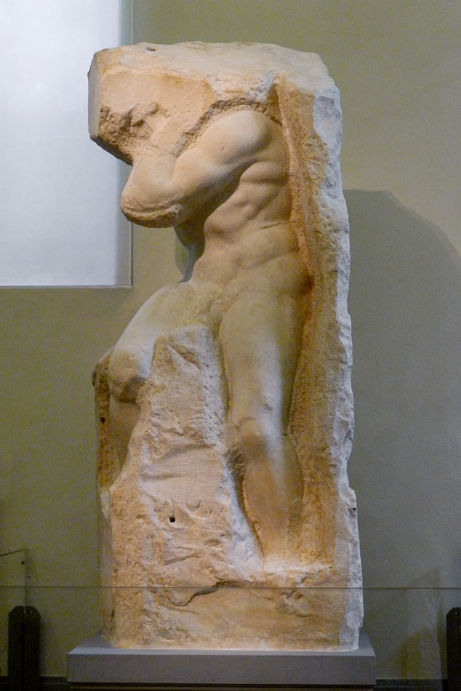
The Beauty of the Unfinished
We tend to think of great art as something complete. Yet throughout art history, some of the most compelling works have remained unfinished — and they often reveal more because of it.
By Culturefold Editors
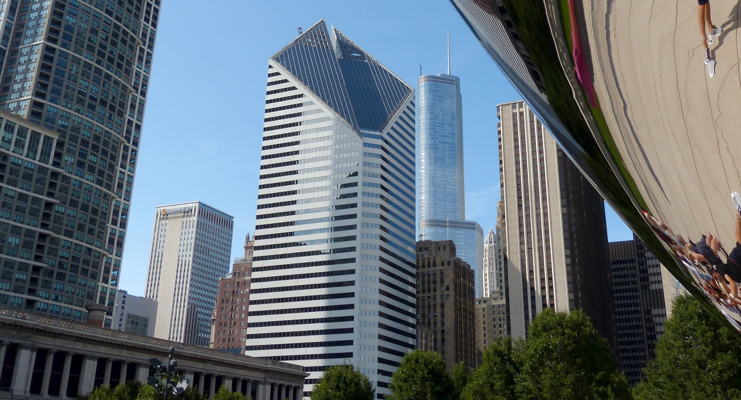
When Art Leaves the Gallery
From Chicago's Cloud Gate to Berlin's East Side Gallery, public art turns streets, parks and squares into places of unexpected encounter.
By Culturefold Editors