
Before the First Page: The Art of the Book Cover
From Penguin's revolutionary paperbacks to the iconic designs of The Great Gatsby and Jurassic Park, exploring how a few centimetres of paper can shape the identity of an entire story.

Walk into a bookshop and something interesting happens before you read a single word.
Certain books immediately attract your attention.
Perhaps it is a striking photograph, an unusual illustration or a title arranged in beautifully considered typography.
Sometimes, the design is remarkably simple.
A single image against a plain background. A carefully selected colour. A few words positioned with just enough space around them.
You pick up the book.
Turn it over.
Read the description.
And perhaps decide to take it home.
The author may have spent years writing the story inside, but the designer responsible for its cover has only a small surface on which to communicate something about that work.
The challenge is extraordinary.
A successful book cover must attract attention, establish an atmosphere and provide enough information for a potential reader to understand what they are holding.
But the best examples achieve something more.
They become inseparable from the books themselves.
Certain designs remain recognisable decades after their publication. Others influence the visual identity of entire publishing houses or change the way particular genres are presented.
The history of book-cover design is therefore about more than attractive packaging.
It is a story about art, commerce, typography and the remarkable power of first impressions.
When Books Became Recognisable Objects
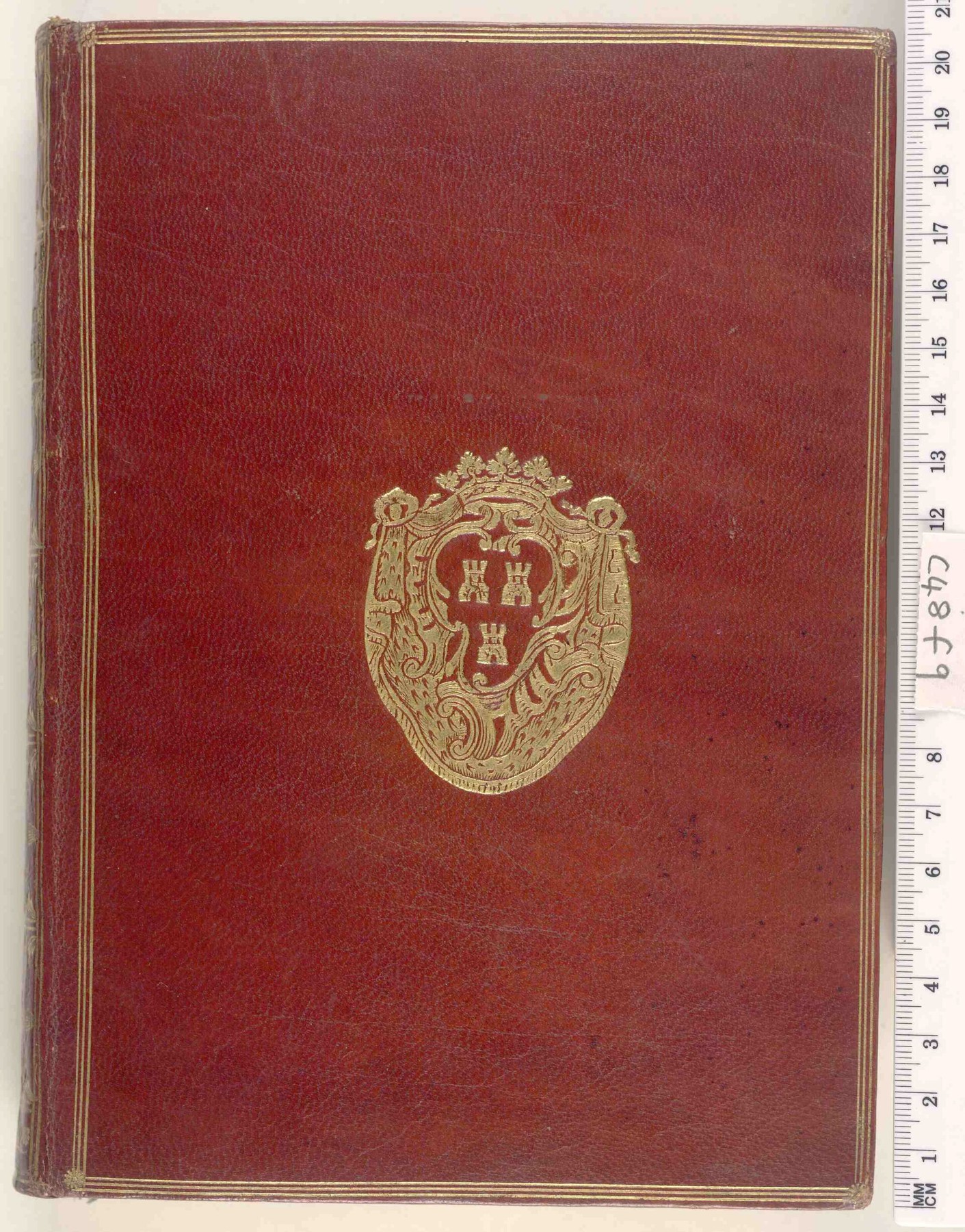
For much of publishing history, the exterior appearance of a book was closely connected to its binding.
Leather, cloth, decorative stamping and other materials helped protect the pages while communicating the value of the object.
Some bindings were elaborate.
Others were deliberately restrained.
But the visual identity of an individual title was not always expressed through a distinctive illustrated cover.
The development of commercial publishing gradually changed that relationship.
As printed books became more widely available, publishers needed ways to differentiate their products.
Paper dust jackets, originally associated primarily with protection, developed into increasingly important promotional surfaces.
Illustration, typography and colour could now be used to communicate something about the contents.
The cover became a form of advertising.
But unlike a conventional advertisement, it remained attached to the product.
Its design accompanied the reader home.
Over time, a book could become recognisable through its exterior appearance alone.
The visual language surrounding literature was beginning to change.
Penguin and the Power of Simplicity
One of the most influential moments in modern book design arrived in Britain in 1935.
Publisher Allen Lane launched Penguin Books with the ambition of making good-quality literature available to a wider audience at affordable prices.
The original paperbacks cost sixpence.
But their appearance was just as distinctive as their pricing.
Designed by Edward Young, the early Penguin covers used a remarkably simple arrangement of three horizontal bands.
A white central section contained the title and author's name.
Coloured sections above and below established the publisher's recognisable visual identity.
The colours also communicated different categories.
Orange represented fiction.
Green identified crime.
Blue was associated with biography.
There were no elaborate illustrated scenes.
No extravagant decorative borders.
The emphasis was on clear typography, a consistent layout and the small penguin symbol.
The result was extraordinary.
Individual books remained recognisable as part of the same collection, even when their authors and subjects were completely different.
Viewed together on a shelf, the covers created a coherent visual system.
The design helped transform the paperback from a relatively inexpensive format into a desirable cultural object.
Penguin demonstrated that affordable products did not require careless design.
Quite the opposite.
A clear, consistent identity could make them more appealing.
A Grid That Changed Publishing
Penguin's visual identity continued to evolve.
During the late 1940s, German typographer Jan Tschichold introduced more rigorous design standards across the company's publications.
He refined typography, spacing, the publisher's symbol and the relationship between the different parts of a book.
The changes established a stronger sense of consistency.
Then, during the early 1960s, another important development emerged.
Polish-born designer Romek Marber was commissioned to redesign Penguin's crime covers under the art direction of Germano Facetti.
Marber developed a system now known as the Marber Grid.
The design reserved a relatively compact area near the top for the publisher's identity, title and author.
This allowed the majority of the cover to be occupied by an image.
Photography, illustration and graphic experimentation could now play a much larger role.
Yet the arrangement remained recognisably Penguin.
The system was flexible enough to accommodate different artistic approaches without sacrificing the wider identity of the series.
Its success led to adaptations across other Penguin collections.
The development demonstrated an important principle.
Good design systems do not necessarily restrict creativity.
They can provide a structure within which creativity becomes more effective.
The Eyes of The Great Gatsby
Some book covers develop a significance extending far beyond their original purpose.
One of the most extraordinary examples accompanied the first edition of F. Scott Fitzgerald's The Great Gatsby, published in 1925.
Its cover was created by artist Francis Cugat.
Against a deep blue background, a pair of enormous eyes appears suspended above a brightly illuminated nighttime landscape.
Red lips float beneath them.
The image is mysterious, theatrical and slightly unsettling.
It does not attempt to depict a conventional scene from the novel.
Instead, it establishes an atmosphere.
The glowing lights suggest wealth and spectacle.
The disembodied eyes introduce a sense of observation and unease.
The composition feels dreamlike, reflecting the novel's wider concerns with ambition, desire and illusion.
Remarkably, Cugat developed the artwork while Fitzgerald was still completing the manuscript.
The author saw the design before publication and expressed enthusiasm for it.
The precise relationship between the cover and the imagery that eventually appeared in the novel remains a subject of discussion.
But the visual connection is fascinating.
The book and its cover appear to have influenced one another during their development.
A century later, Cugat's artwork remains among the most recognisable images associated with American literature.
The design has become part of the cultural identity of the novel itself.
When a Cover Suggests Rather Than Explains
The success of The Great Gatsby cover reveals something important about graphic design.
An image does not need to explain the entire story.
Sometimes, suggestion is more powerful.
A literal cover might depict the main characters, a recognisable setting or a dramatic event.
Such approaches can be effective.
But they also risk telling the reader exactly what to imagine.
A more interpretative design leaves space for curiosity.
It communicates an emotional atmosphere rather than a complete visual explanation.
During the mid-twentieth century, American designer Alvin Lustig developed this approach through his work for publisher New Directions.
His covers frequently combined abstract shapes, carefully considered typography and symbolic imagery.
Rather than illustrating specific scenes, Lustig sought visual ideas that communicated something about the underlying character of the writing.
The resulting designs could appear surprisingly modern.
Bold forms occupied restrained backgrounds.
Unusual arrangements created tension.
Typography became an expressive element rather than simply a method of presenting information.
Lustig demonstrated that book-cover design could become a form of visual interpretation.
The designer was not merely decorating the author's work.
They were responding to it.
The Dinosaur Everyone Recognises
In 1990, designer Chip Kidd created a cover that would develop into one of the most recognisable images in contemporary popular culture.
The book was Michael Crichton's Jurassic Park.
Its cover featured the skeleton of a Tyrannosaurus rex rendered as a stark silhouette.
Set against a predominantly white background, the dinosaur appeared immediately striking.
The composition was simple.
There was no elaborate prehistoric landscape.
No detailed reconstruction of a living animal.
Instead, a skeletal form communicated the central idea with extraordinary efficiency.
The image suggested scientific discovery, danger and the unsettling possibility of bringing something extinct back into the modern world.
Kidd's silhouette subsequently became the foundation of the visual identity for Steven Spielberg's 1993 film adaptation.
Additional graphic elements and typography were introduced for the film, but the dinosaur illustration remained central.
The design had crossed from publishing into cinema.
And eventually into a much wider world of merchandise, entertainment and popular culture.
What began as a book-cover illustration became an internationally recognisable symbol.
Its success demonstrates how a strong visual idea can survive across different media.
The image did not need elaborate detail.
Its simplicity made it memorable.
The Importance of What Is Missing
Many successful book covers depend as much on what they leave out as on what they include.
A crowded design may contain numerous images, decorative details and competing pieces of information.
A restrained composition can create a stronger focal point.
The viewer knows where to look.
Typography becomes easier to understand.
A particular image acquires greater significance.
This does not mean minimalist design is always superior.
Illustrated fantasy novels, historical fiction and children's books can benefit enormously from rich visual detail.
The appropriate approach depends on the subject, audience and intended experience.
But every cover requires a hierarchy.
The designer must decide which elements deserve attention first.
Is the author's name the most important information?
Should the title dominate?
Does the image communicate enough to attract a reader from across a bookshop?
These decisions may appear small.
Together, they determine how effectively the cover communicates.
Good design is often the result of choosing what not to include.
When the Book Becomes a Beautiful Object
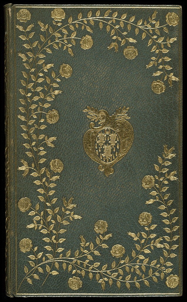
In 2008, Penguin introduced a collection that demonstrated the continued importance of physical book design.
The Clothbound Classics series, designed by Coralie Bickford-Smith, reimagined familiar literary works as beautifully constructed hardcover editions.
Each cover featured a distinctive arrangement of repeating decorative motifs.
The designs drew upon themes, objects and imagery found within the stories.
Cloth-covered surfaces and foil-stamped patterns created a tactile quality that distinguished the books from ordinary paperbacks.
The result was both contemporary and traditional.
The series referenced the history of decorative bookbinding while introducing a recognisable modern visual language.
The individual books were different, yet clearly belonged together.
Displayed on a shelf, they formed a coherent collection.
Their appeal extended beyond readers searching for a particular novel.
The books became objects people wanted to collect, display and keep.
Bickford-Smith's work revealed something important about design in the digital age.
The physical experience of an object can remain valuable even when its contents are available through other formats.
A story may be read on a screen.
But a carefully designed book offers additional qualities.
Weight.
Texture.
Colour.
And the pleasure of owning something thoughtfully made.
Designing for a Smaller Screen
Today, book covers face another challenge.
Many readers encounter new titles through online retailers, social platforms and digital reading applications.
The first impression may take place on a phone rather than in a bookshop.
A cover that looks beautiful when printed at full size can become difficult to understand when reduced to a small thumbnail.
Fine details may disappear.
Subtle typography becomes unreadable.
Complex compositions can lose their impact.
Designers must therefore consider how a cover performs across different scales.
Bold typography, strong contrast and recognisable shapes can help maintain clarity.
But the challenge is not simply to make every design louder.
It is to preserve a distinctive visual identity while adapting to new contexts.
The physical book still matters.
So does the digital image representing it.
A contemporary cover may need to work as a printed object, a shop display, a social media image and a small icon within an online catalogue.
The fundamental purpose remains familiar.
Attract attention.
Communicate character.
Encourage curiosity.
But the environments in which that purpose must be achieved have multiplied.
Who Really Designs a Book?
Although a book is usually associated with its author, the visual identity surrounding it frequently involves several creative professionals.
Art directors establish approaches and oversee the design process.
Graphic designers develop typography, layout and visual concepts.
Illustrators and photographers contribute imagery.
Editors, marketing teams and publishers influence how the final design is positioned.
The result is collaborative.
But the contribution of the cover designer is often less visible than that of the writer.
Readers may recognise the cover of a favourite novel without knowing who created it.
The same is true of many familiar works of graphic design.
Their success can make them seem inevitable.
As though the visual identity had always belonged to the book.
In reality, it emerged through research, experimentation and countless practical decisions.
Recognising the designer does not diminish the work of the author.
It acknowledges the different creative disciplines involved in bringing a book into the world.
The story and its visual presentation are distinct achievements.
And the most memorable examples often complement one another remarkably well.
A Story Before the Story
The evolution of book-cover design reveals an extraordinary relationship between literature and visual culture.
Penguin's early paperbacks demonstrated how a consistent graphic identity could make affordable books desirable.
Alvin Lustig explored the possibilities of abstraction and visual interpretation.
Francis Cugat created an image that became inseparable from The Great Gatsby.
Chip Kidd transformed a dinosaur skeleton into a symbol recognised around the world.
Coralie Bickford-Smith reimagined classic literature as beautiful physical objects intended to be kept and treasured.
Their approaches were very different.
Yet each recognised that the space surrounding a story can influence how that story is encountered.
A cover can suggest an atmosphere.
Establish expectations.
Create curiosity.
Or make a familiar book feel entirely new.
It cannot replace the experience of reading.
Nor should it attempt to.
Its purpose is something more subtle.
To create a moment of connection before the first page.
The next time a book attracts your attention, consider what made you notice it.
Perhaps it was the colour.
The typography.
An unexpected image.
Or simply the confidence of a design that understood when to leave something unsaid.
Before you read the opening sentence, somebody has already begun telling you a story.
And sometimes, that story begins with nothing more than a beautifully designed cover.
Further Reading

Finding Our Way: The Art of Wayfinding
From New York's subway to Munich 1972 and Schiphol, how wayfinding design quietly guides millions of people through complex spaces.
By Culturefold Editors
The Poster: Design Made Public
From Parisian streets to Swiss typography and Polish cinema, how the poster became one of design’s most powerful cultural mediums.
By Culturefold Editors

The Quiet Intelligence of Everyday Objects
OXO Good Grips, Harry Beck's Tube map and the Anglepoise lamp reveal how the best everyday design makes its effort almost impossible to notice.
By Culturefold Editors