
Finding Our Way: The Art of Wayfinding
How signs, symbols, typography and colour quietly guide millions of people through the world's most complex spaces.
There is a particular moment of uncertainty that almost everybody has experienced.
You arrive at an unfamiliar airport, emerge from a busy railway platform or step into an enormous public building. People move around you with apparent confidence, but you have no immediate sense of where to go.
Then you notice a sign.
A simple arrow points towards the exit. A familiar symbol indicates the location of a lift. A coloured line identifies the platform you need.
Within seconds, the confusion begins to disappear.
We rarely stop to appreciate these moments because successful wayfinding is designed to feel effortless.
The most effective systems allow us to navigate complex environments without consciously considering the decisions that made them understandable.
Yet behind every carefully positioned sign, legible typeface and recognisable symbol is a process involving psychology, architecture, graphic design and human behaviour.
Wayfinding is the discipline of helping people understand where they are, where they need to go and how to reach their destination.
And some of the most influential examples have fundamentally changed how we experience the modern world.
The Design We Barely Notice
Unlike a poster, a piece of furniture or a carefully designed product, wayfinding rarely exists to attract prolonged attention.
Its purpose is almost the opposite.
It should communicate the necessary information as quickly and clearly as possible.
A passenger rushing to catch a train does not want to admire the typography above a platform.
They want to know whether they are travelling in the right direction.
This creates an unusual challenge for designers.
A wayfinding system must be visible enough to attract attention when needed, but unobtrusive enough to coexist with the surrounding environment.
It must communicate clearly to people who may be tired, distracted, unfamiliar with the language or under considerable time pressure.
And it must function within spaces that can be architecturally complicated.
An airport might contain dozens of gates, different terminal levels and separate routes for arriving and departing passengers.
A hospital may need to guide visitors towards departments distributed across several connected buildings.
An underground railway network must help people understand platforms, directions, interchange points and exits.
Simply placing more signs around these environments rarely solves every problem.
In fact, too much information can make navigation more difficult.
Good wayfinding depends on deciding what people need to know, and precisely when they need to know it.
New York: Bringing Order Underground
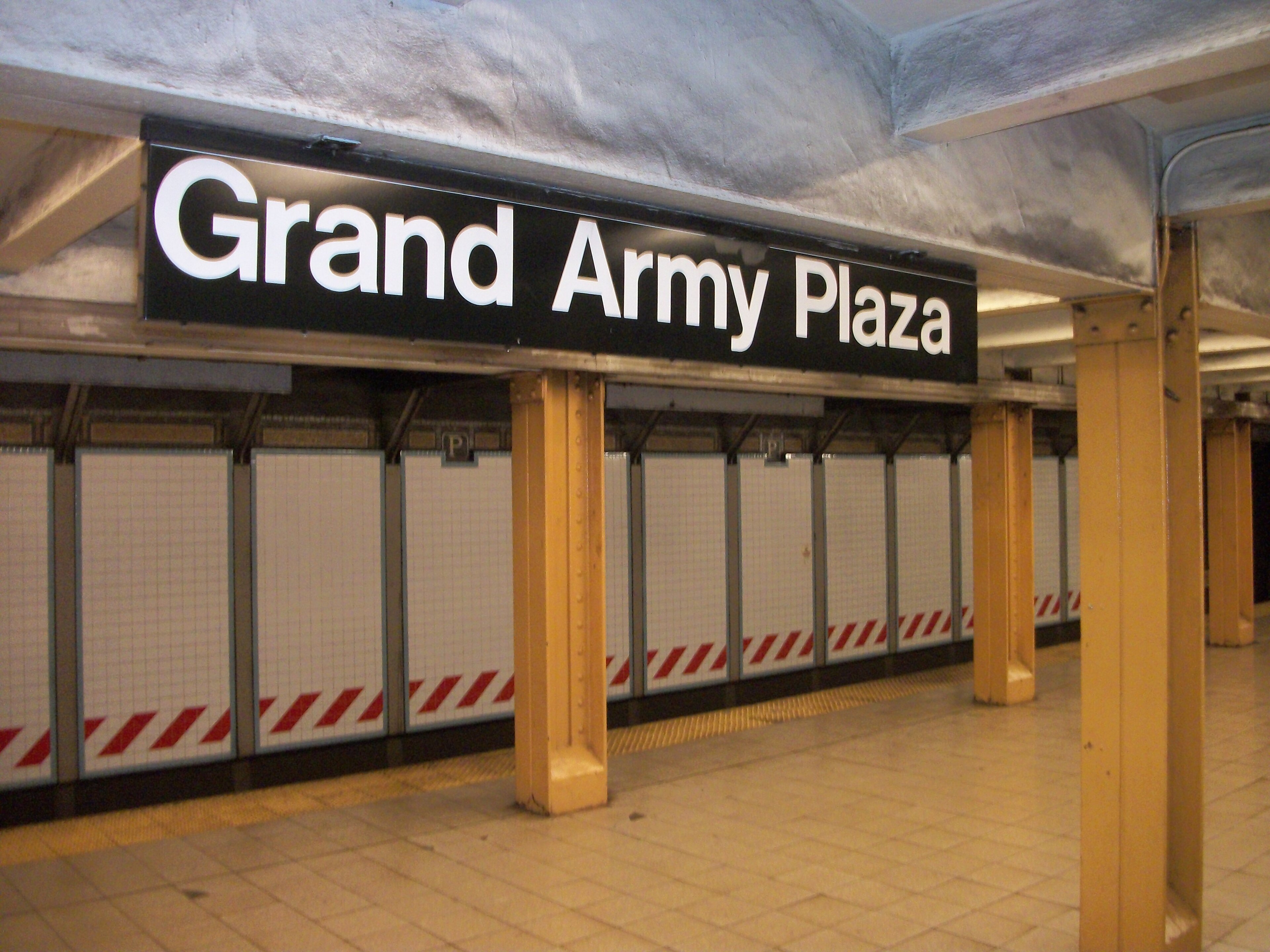
By the middle of the twentieth century, New York's subway system had become an increasingly complicated network.
Different lines, station arrangements and inherited signage conventions created challenges for passengers attempting to navigate the system.
The network had expanded through the integration of previously separate transit operations, leaving behind inconsistencies in how information was presented.
During the 1960s, the New York City Transit Authority sought a more coherent approach.
The design firm Unimark International was commissioned to develop a unified graphic system, with designers Massimo Vignelli and Bob Noorda playing central roles.
Their work resulted in the New York City Transit Authority Graphics Standards Manual, published in 1970.
The document established a systematic approach to station signage.
Typography, arrows, route identification, colours and spacing were organised according to consistent rules.
The objective was straightforward.
Passengers should be able to recognise information quickly, regardless of which station they were using.
The designers treated signage not as a collection of individual objects but as parts of a connected visual system.
A directional arrow in one station needed to operate according to the same visual principles as an arrow elsewhere.
Station names required consistent treatment.
Route information needed to remain understandable within the often-crowded visual environment of the subway.
Vignelli also became known for his diagrammatic New York subway map, introduced in 1972, which emphasised the relationships between routes rather than precise geography.
That map proved controversial and was replaced in 1979.
But the broader signage work demonstrated something particularly important.
Consistency could make an enormous transport network easier to understand.
The contribution of graphic design was not simply making the subway look more attractive.
It was establishing a visual language that could help millions of passengers move through it.
Munich 1972: Communicating Without Words
In 1972, Munich hosted the Summer Olympic Games.
The event presented an extraordinary communication challenge.
Athletes, officials, journalists and spectators arrived from countries around the world, speaking many different languages.
The organisers needed a way to communicate information clearly without relying entirely on written instructions.
German designer Otl Aicher led the development of the Games' visual identity.
His work included a coordinated system of typography, colour, signage and pictograms.
The sporting symbols became one of the project's most enduring achievements.
Each pictogram represented an activity through a simplified arrangement of geometric forms.
A figure running.
A person cycling.
An athlete performing a particular movement.
Rather than creating each illustration independently, the design team used a systematic grid to establish consistent proportions and relationships between the elements.
The result was a family of symbols that appeared visually connected.
Individual pictograms could be recognised, while the overall collection retained a coherent identity.
The approach was influenced by earlier Olympic pictogram systems, including those developed for Tokyo in 1964.
But Munich's visual programme became particularly influential in establishing how a complete collection of symbols could function together.
The achievement extended far beyond sport.
It demonstrated the potential of pictograms to communicate practical information across language barriers.
Today, we encounter similar visual principles in airports, railway stations, museums and public buildings.
An image of a person moving along an escalator or a simplified wheelchair symbol can communicate meaning without requiring a full written explanation.
These symbols are not necessarily understood identically by every person in every culture.
But when thoughtfully designed and consistently applied, they can help make unfamiliar environments more accessible.
The influence of Munich's visual identity continues to be felt in the ordinary signs we encounter every day.
London and the Power of Recognition
Some wayfinding systems become so familiar that they form part of a city's cultural identity.
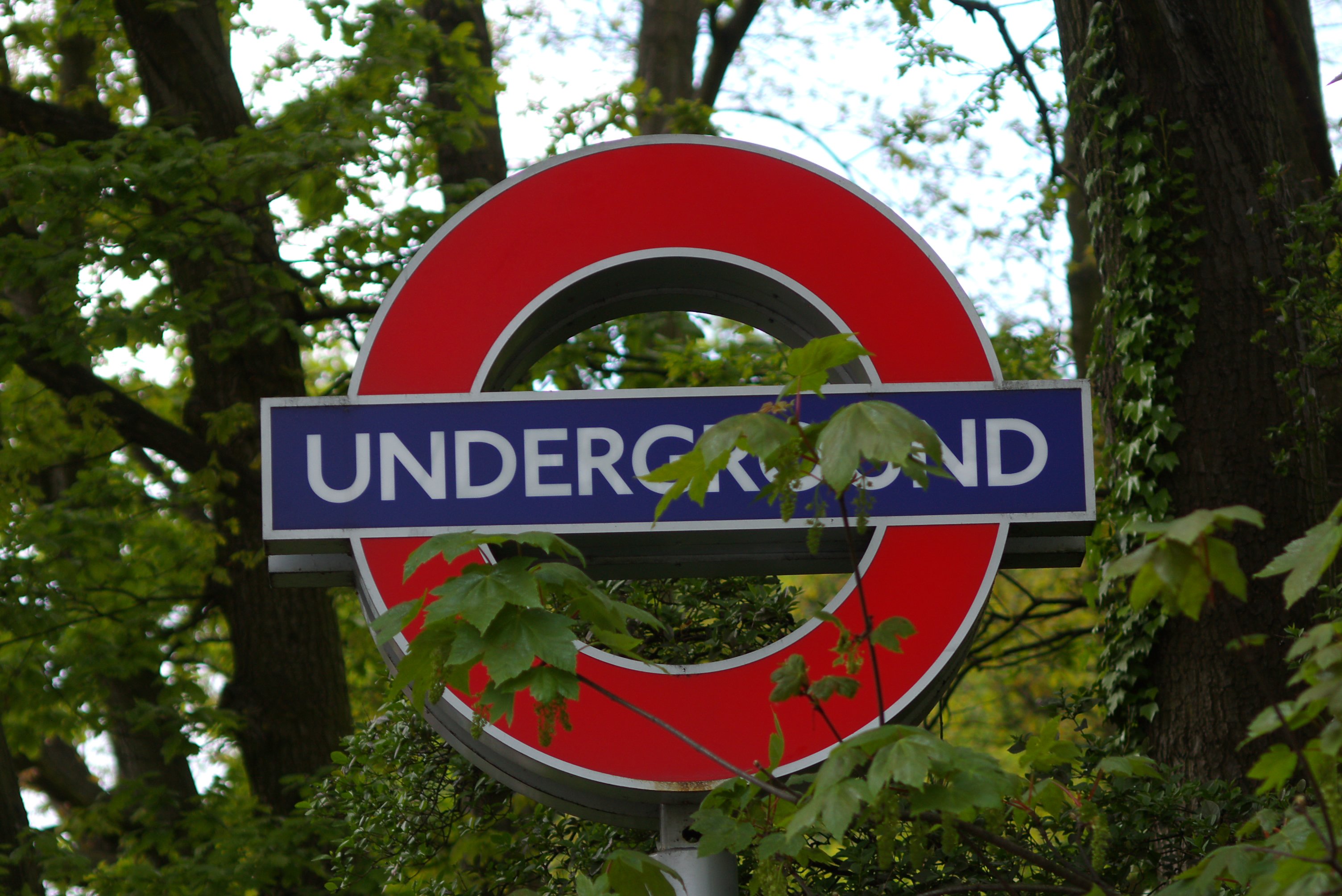
London's Underground provides an especially recognisable example.
Its red circular symbol crossed by a blue horizontal bar, commonly known as the roundel, has evolved into one of the most familiar transport identities in the world.
The design developed from earlier Underground signage introduced in the early twentieth century.
In 1916, Edward Johnston was commissioned to develop a new typeface for the Underground.
He also contributed to the development of the roundel's recognisable form.
The resulting visual identity helped establish a consistent relationship between typography, colour and transport information.
The red circle, blue bar and distinctive lettering became instantly recognisable elements of the network.
Their success lies partly in consistency.
The symbol appears across stations, maps and other passenger information, creating a familiar point of reference.
A visitor does not need to read a long explanation to identify an Underground entrance.
The visual identity communicates the transport system's presence almost immediately.
This illustrates another important function of wayfinding.
It does not simply tell people which direction to travel.
It helps them recognise where they are and what services are available.
Over time, a practical system of public information can become an essential part of a city's visual character.
Schiphol: Designing for the Unfamiliar
Airports present some of the most demanding environments for wayfinding design.
Passengers arrive from different countries, often carrying luggage, travelling under time pressure and trying to interpret unfamiliar surroundings.
They may need to identify check-in areas, security checkpoints, departure gates, baggage reclaim, transport connections and exits.
A mistake can have significant consequences.
Missed flights, unnecessary walking and passenger congestion can all result from unclear information.
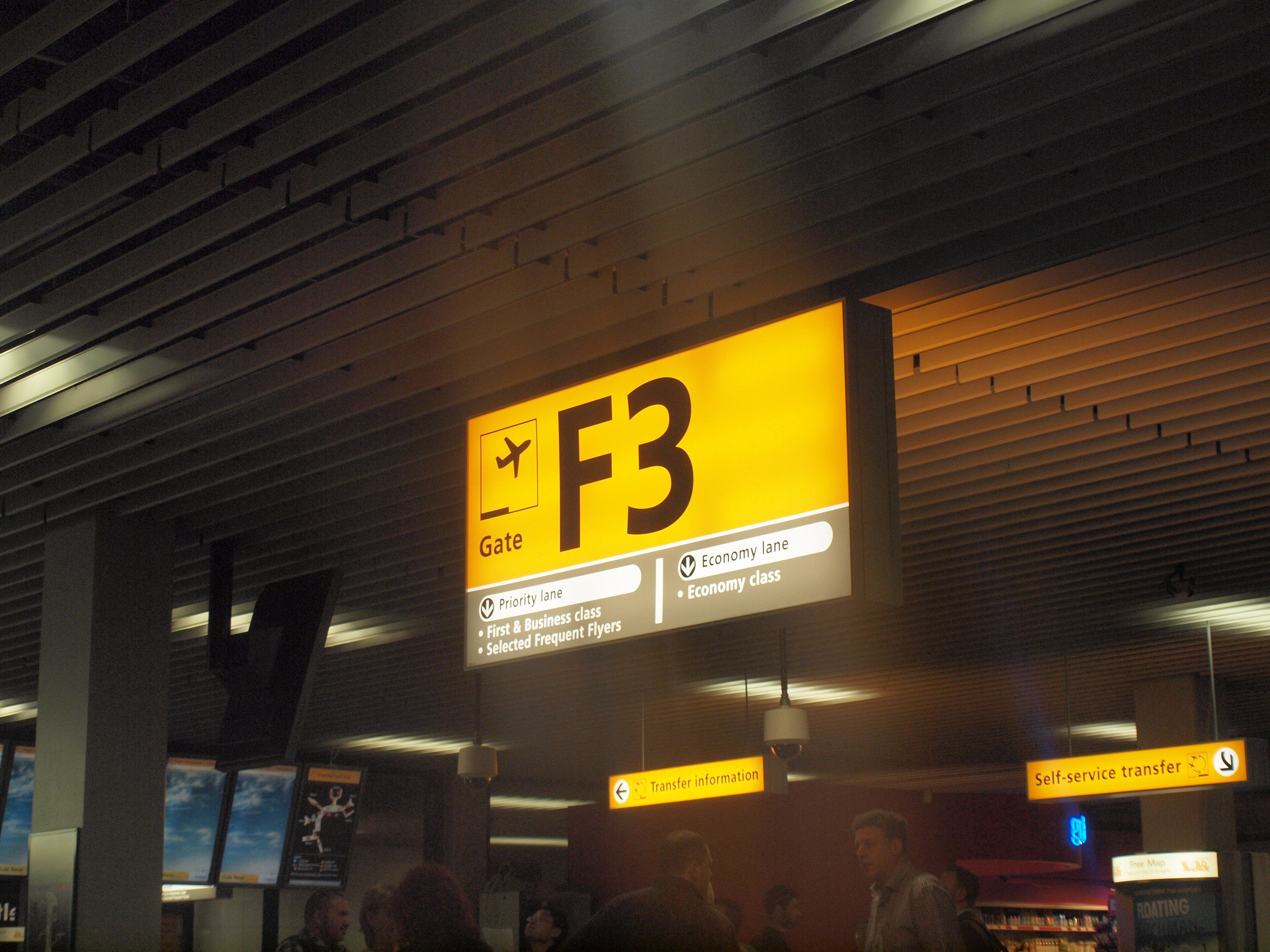
Amsterdam's Schiphol Airport has played an influential role in the development of modern airport signage.
In 1967, designer Benno Wissing developed a system built around clarity, colour coding and the needs of passengers.
During the 1990s, the design studio Mijksenaar further developed the airport's wayfinding approach.
The system uses strong colour distinctions, clear typography and recognisable symbols to help passengers identify different kinds of information.
Yellow is strongly associated with primary travel directions, while other colours distinguish supporting services and information.
These decisions are not simply aesthetic preferences.
They establish a visual hierarchy.
A traveller searching for their departure gate needs to identify essential directional information before less urgent details.
Colour helps separate those priorities.
Typography contributes legibility.
Arrows provide clear movement instructions.
The arrangement of information allows passengers to make decisions as they approach important points within the terminal.
The most effective airport signage anticipates what people need to know before they become confused.
And that requires more than producing attractive signs.
It involves understanding the experience of moving through the building.
Why Placement Matters More Than Quantity
A beautifully designed sign can still fail if it appears in the wrong location.
Imagine walking through a large railway station towards a junction where several corridors meet.
The information needed to choose a route should be available before reaching the decision point.
If the sign appears after the junction, it may already be too late.
Similarly, a directional arrow that disappears from view after the first turning can leave people uncertain about whether they should continue.
This is why wayfinding design depends on continuity.
Information must be presented at appropriate intervals, particularly where routes divide or become less obvious.
The relationship between signs and physical space is essential.
A wide corridor may naturally suggest a main route.
A visible staircase can communicate vertical movement.
A distinctive architectural feature may provide a memorable landmark.
Successful wayfinding uses these environmental qualities alongside graphic information.
The goal is not to cover every surface with instructions.
It is to create an environment in which movement feels understandable.
Sometimes, the most effective improvement is removing unnecessary information.
At other times, it involves reconsidering the physical arrangement of a space rather than introducing additional signs.
Wayfinding is therefore both a graphic and an architectural challenge.
Its success depends on how the two disciplines work together.
Designing for Everyone
One of the most important responsibilities of wayfinding is accessibility.
Not everybody experiences an environment in the same way.
Some people have visual impairments.
Others may have difficulty interpreting complex information, limited mobility or reduced familiarity with the language being used.
Children and older visitors may also respond differently to the same visual instructions.
A system that works well for one audience may create barriers for another.
High contrast can improve the visibility of text and symbols.
Clear typography helps information remain legible at different distances.
Consistent language and familiar pictograms can reduce unnecessary confusion.
But visual signs alone are not sufficient for everybody.
Tactile paving, audible announcements, Braille and raised lettering can provide alternative ways of understanding an environment.
Accessible routes must also be considered.
A sign directing wheelchair users towards a lift is only useful if the route itself is practical and accessible.
Colour coding presents another challenge.
If information relies entirely on distinguishing colours, people with colour-vision deficiencies may struggle to interpret it.
Combining colour with text, symbols or other identifiers provides additional ways to understand the same information.
These considerations demonstrate that good wayfinding is not simply about visual elegance.
It is about ensuring that as many people as possible can move through public environments with confidence and independence.
When Design Becomes Invisible
One of the most interesting characteristics of wayfinding is how rarely people discuss it when everything works.
We notice confusing signs.
We remember the airport where we struggled to find our gate.
We complain about unclear exits, misleading directions and buildings that seem unnecessarily difficult to navigate.
But when a system operates successfully, the experience can pass almost unnoticed.
The information appears exactly where it is needed.
The symbols make sense.
The route becomes clear.
And we continue towards our destination without giving the design another thought.
This creates an unusual relationship between design and recognition.
Some of the most visually influential graphic systems have achieved their success by reducing the amount of attention required from the viewer.
Their purpose is not to become the focus of an experience.
It is to make the experience itself easier.
That does not mean the design lacks creativity.
On the contrary, making complicated information appear simple often requires extraordinary consideration.
Each symbol must communicate clearly.
Every decision about scale and spacing affects readability.
The entire system must remain coherent across different locations and practical circumstances.
What appears effortless to the passenger may represent years of development and refinement.
Finding Our Way in a Digital World
Digital technology has introduced new possibilities for navigation.
Smartphones provide detailed routes through unfamiliar cities.
Interactive airport displays can respond to changing flight information.
Transport applications offer real-time updates, helping passengers adjust their journeys.
These developments have transformed how people understand and navigate physical environments.
Yet traditional wayfinding has not become irrelevant.
A smartphone cannot replace every sign in a railway station.
Digital information may be unavailable, difficult to access or impractical while moving through a crowded environment.
Physical signage remains important because it provides information directly within the space where decisions must be made.
Increasingly, the challenge is to ensure that digital and physical systems work together.
A route displayed on a phone should correspond clearly with the signs encountered along the way.
A departure gate listed on an airport screen should be easy to identify using the terminal's directional information.
The individual technologies may be sophisticated.
But the fundamental objective remains familiar.
Help people understand where they are and where they need to go.
The Beauty of Knowing Where to Go
It is easy to overlook the influence of wayfinding on everyday life.
The arrows above a station platform.
The colours identifying different airport services.
The symbols guiding visitors through a museum.
The lettering that makes an unfamiliar place feel more understandable.
These elements form a quiet visual infrastructure surrounding much of modern life.
Their value is not measured primarily by how beautiful they appear in isolation.
It lies in their ability to communicate clearly, reduce uncertainty and help people move through complicated environments.
The designers responsible for these systems rarely receive the public recognition associated with architects, fashion designers or celebrated artists.
Yet their work influences millions of individual experiences every day.
A carefully positioned sign can prevent a missed connection.
An accessible symbol can help somebody navigate independently.
A consistent visual system can turn an intimidating environment into one that feels manageable.
There is something remarkable about that achievement.
A few lines, letters, colours and shapes can make an enormous and unfamiliar space easier to understand.
And perhaps the greatest success of wayfinding is that we rarely notice it happening.
We simply find our way.
Further Reading
The Poster: Design Made Public
From Parisian streets to Swiss typography and Polish cinema, how the poster became one of design’s most powerful cultural mediums.
By Culturefold Editors

The Quiet Intelligence of Everyday Objects
OXO Good Grips, Harry Beck's Tube map and the Anglepoise lamp reveal how the best everyday design makes its effort almost impossible to notice.
By Culturefold Editors
The Art of Seeing Differently
A closer look at how creativity changes our understanding of familiar places, everyday objects and the world we inhabit.
By Culturefold Editors